If you haven’t seen the social media brouhaha about #the dress this past week, count yourself lucky, and sheltered. But it does raise fascinating questions about what we see, how we see it, and how what we perceive may not necessarily be what objectively exists. In the case of #thedress — or rather, the photo of #thedress — some people see it as gold and white, and some as black and blue (it’s “actually” black and blue).
(Click on any photo below to enlarge it.)


“What we do see depends mainly on what we look for. … In the same field the farmer will notice the crop, the geologists the fossils, botanists the flowers, artists the colouring, sportsmen the cover for the game. Though we may all look at the same things, it does not all follow that we should see them.” ― John Lubbock
What we see, hear, taste, smell, touch are subject to complex neurological, physiological, and psychological filtering, distortion, and interpretation. For example, when it comes to sight, context — in the case of #thedress , the lighting of the object — determines what colour we think we see, as do factors like our prior experience, our expectations, the patterns our brain knows, the effectiveness of our eye mechanism (including the rods and cones in our retina), optic nerve, visual cortex, and so on.


As Isaac Newton noticed, color is not an inherent property of things. What we see when we look at an object is the light being reflected by it. And yet, as shown by the fervour of certainty displayed in #thedress kerfuffle, most of us are certain that when we see gold, we are seeing gold, and that when we see blue, we’re seeing blue. (In fact, probably many of us are certain that we can discern teal from mint.) We rarely stop to consider that an object that looks blue to us is not physically colored blue. (see note *)
* * * * *
“What I’ve always found interesting in gardens is looking at what people choose to plant there. What they put in. What they leave out. One small choice and then another, and soon there is a mood, an atmosphere, a series of limitations, a world.”
― Helen Humphreys, The Lost Garden
I bring #thedress up — you were wondering, right? — because of Michelle Chapman’s blog posting at Veg Plotting yesterday, referencing both the viral phenomenon of #thedress and her 2011 article on Colour Theory for Garden Design at BBC Gardening. In the Veg Plotting post, she lists some factors that determine what we see: “our education; what’s in fashion; our cultural background; the impact of light, the weather and seasons; where we are in the world; our mood and other psychological factors; our experiences; our age; and a whole host of other things.”
“Mood” is one factor in her list that stands out for me. It’s long been thought that colour affects one’s mood and also causes physiological reactions. But the idea that the reverse is true, that mood may affect our perception of colour, is very intriguing to me. It’s an idea that’s not new — we talk about “seeing the world with rose-coloured glasses,” for instance, implying that one’s view of the world can be filtered by one’s mood or attitude — but it points to the complexity of our neurological and psychological processes and how they may strongly influence, without our awareness, what we see.


In one small study at the Univ. of Toronto in 2009, test participants in a good mood actually took in more visual information about what they were looking at than those in a bad mood. In another study, in 2011, participants interpreted visual input differently depending on the kind of music (happy or sad) they were listening to as they looked at images.
In other words, what we hear, see, smell, taste, or touch can change our mood, and our mood can change our perception or interpretation of what we hear, see, smell, taste, or touch. It’s an interesting cycle.
If you take a flower in your hand and really look at it, it’s your world for a moment. — Georgia O’Keeffe

Back to Chapman’s article at BBC Gardening: She says, “I’ve found the yellow of March is just right for now. Not only because it lifts us away from the gloomy days of winter, but also the angle of the sun is perfectly poised to make our daffodils glow.” Of course, we have snow and not daffodils here in northern New England in March, but her point is taken, that a certain yellow in a certain late winter light lifts the mood.

Chapman says that one summer, she realised that all the flowers in her seasonal pots were white, which she puts down perhaps to a need to visually balance those yellow daffs, April tulips, and late spring alliums: “By the time I came to choose my summer plants, I think my eyes and brain had overdosed a little (this is a known phenomenon) and needed the calming influence of white to help them chill out.”


* * * * *
We may well choose the colour of our garden plants and flowers to match our mood and/or our concomitant physiological need (e.g., for energy when our mood is low, for tranquility when it’s frenetic, for a sense of elegance when feeling messy); perhaps it’s also our mood in late winter that causes us to perceive the March daffodil yellow as yellower, or glowier, or richer, more dynamic and cheering, or like soft butter to the hard crusty soul of winter. If the Univ. of Toronto study I cited earlier is indicative, it may be that when we’re in a good mood — expectant and hopeful as the seasons turn from winter to spring — we simply see more of the light reflections than otherwise.
And, in this mood, we may also se e more of the context around the yellow flower, more of the “negative space,” or ma, a Japanese word for space, which, as Japanese Gardens Online describes it, “refers to the interval, space or void between two or more stationary objects — the area between two rocks or a couple of trees, for example.”
In a Kyoto Journal article, Gunter Nitschke talks about how the ideogram for the Japanese characters we translate as ma reflects both objective and subjective reality:
“Originally, this character consisted of the pictorial sign for “moon” (月) — not the present-day “sun” (日) — under the sign for “gate” (門). For a Chinese or Japanese using language consciously, this ideogram, depicting a delicate moment of moonlight streaming through a chink in the entranceway, fully expresses the two simultaneous components of a sense of place: the objective, given aspect and the subjective, felt aspect.”
When we see (visually register) this “space around” an object, or the space between one object and another, we may have a deeper experience of the object and its relationship to its space; we may feel a heightened awareness of space, place, and time, of what feels real; the object may not only “look” different but it and its surroundings may feel different to us.


Nitschke’s example of ma in a garden design is the “layout of traditional Japanese stroll gardens and, on a smaller scale, in the placement of tobi-ishi (“skipping stones”) used to make garden paths. By a sophisticated placing of the stones, our foot movements can be slowed down, sped up, halted or turned in various directions. And with our legs, our eyes are manipulated, and our visual input from spatial phenomena is structured over time.”
Time for you and time for me,And time yet for a hundred indecisions,And for a hundred visions and revisions,Before the taking of a toast and tea.— TS Eliot, The Love Song of J Alfred Prufrock* * * * *
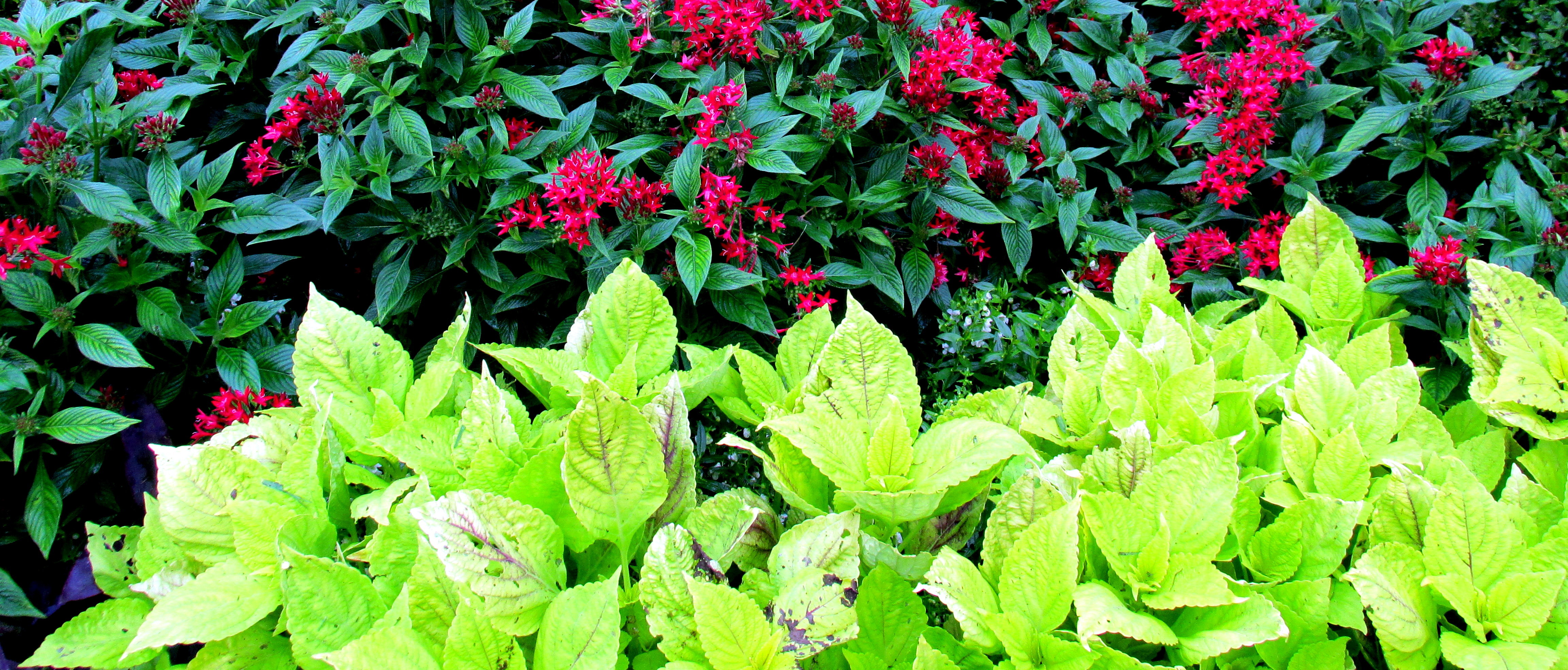
Of course, this is what good garden designers know — how to structure our visual input, inasmuch as it’s in their control — and use in developing a garden that feels balanced and unified, while at the same time alluring, welcoming, dramatic, peaceful … with Mother Nature being one of the best designers on the planet. Most of us have heard that using cool colours (blues, some pinks, violets, silver, sometimes green) or pastels in the garden creates a landscape that feels peaceful, while warm colours (yellows, oranges, reds, neons) and bright ones create a more vibrant, energetic feeling space, and neutrals (whites, greys, brown, and sometimes greens) provide a restful backdrop.


You can put a gardener behind the wheel, but you can’t keep her eyes off the landscape. — Janet Macunovich


But there is so much more to our visual experience of a garden or any landscape than this. A space like a garden holds within it dimension, plane, curvature, linearity, circularity. It speaks of the here-and-now and may remind us of a time far away. It comforts us and enchants us. With the addition of “skipping stones” as mentioned above, curving walkways, fences and gates, covered arbors and pergolas, teepees, swaths of flowers of a single colour or a meadow-like intermixing of many colours, dramatic focal points at the end of a grassy lawn, kinetic sculpture, hillsides and slopes, thickly wooded areas and open areas, chimes and waterfalls, strongly scented flowers, rain gardens, rock gardens, textured plants, waving grasses, ferny wet spaces, ponds and pools … With the addition of these elements and more, a garden or landscape speeds us up, slows us down, changes our rhythm, changes our awareness of time and the dimensions of space, feels remote or accessible, elicits whimsey or solemness, makes us feel at home or takes us to exotic lands, piques our curiosity, soothes us, rebalances or re-energises us, reassures us that all is well.


Of course, we don’t need to be in a good mood to be susceptible to ma, to the space between things (though being in a good mood may enable us to visually register the periphery better than otherwise), or to be receptive to the other mood-altering design elements found in gardens and wild lands. But it might help.
* * * * *
A piece on the website Mokuri’s Temple about ma suggests that it connotes the idea that “there is openness in everything and nothing exists alone. All objects interact with one another in space. In fact, the space of the garden only exists because there is a larger space outside of it.” This reminds me of the system thinking concept found in permaculture (and other disciplines), which holds that it’s not the elements themselves as much as the relationship among all elements in a system that determines the effectiveness of the system. In permaculture, emphasis is more often on functional relationships — how well soil, water, structures, plants, animals, etc., work together to maintain a healthy, sustainable ecosystem– but smooth functioning in the garden (as in other aspects of life) often relies on auspicious spatial relationship, as described in this piece about the placement of a compost site, a fruit tree, and a tomato plant, creating an effective and low-maintenance functional relationship by placing elements in good spacial relationship and letting them mutually benefit each other.


In the same way, when we design a garden for visual impact and beauty, placing plants and other elements with an awareness that “all objects interact with one another in space” and “nothing exists alone,” we open the possibility that the viewer can enter into both the objective world (the garden) and the subjective world (the effect of sensory input on mood and soul) in each moment.
* * * * *
 We may never know the difference between the way I see a yellow daffodil and the way you do — and how we see that yellow in March may differ from how we see it in May, and how we see it in the garden may differ from how we see it in when it’s cut and in a vase in the kitchen. Yet we can ponder and appreciate the interactions of objects, the relationships among them, and the notion that our perception is liable to be influenced by many factors of which we’re only obscurely aware.
* * * * *
* Detailed catalog of theories about colour and where it’s located: in the object, in the brain, or in the relationship between the viewed and the viewer.
* * * * *
Bonus: Fascinating article at Kyoto Journal (again by Gunter Nitschke) with a section on the difference between the activity of seeing and the passivity of hearing and how a Japanese garden takes this into account. And this beautiful meditation on the boundaries between nature and non-nature, while sitting in a Japanese garden, by Marc Keane, also in Kyoto Journal.
For more on garden design elements (form, line, repetition, balance, etc.):
Design Principles in Garden-Making (Linda Engstrom, APLD)
* * * * *
All gardening is landscape painting. — Horace Walpole

Leave a Reply